Candlestick charts are one of the most widely used tools in financial markets. Unlike a simple line chart, a candlestick shows four key pieces of information for a specific time period: the opening price, the highest price, the lowest price, and the closing price. This additional detail helps traders understand the ongoing battle between buyers and sellers and how market sentiment may be changing.
Learning to read candlestick charts is often one of the first steps in technical analysis. While a single candle cannot predict future price movement, a series of candlesticks can reveal trends, momentum shifts, and potential reversal signals when combined with other forms of analysis.
If you’re new to trading, understanding how candlestick charts work can provide a solid
foundation for interpreting market behavior and making more informed trading decisions. In this guide, you’ll learn the basics of candlestick charts, their key components, and how traders use them to analyze the market.

What Is a Candlestick Chart?
A candlestick chart is a type of price chart that displays how an asset moves over a specific period of time. Each candlestick represents one trading session, which can range from 1 minute to 1 month, depending on the selected timeframe.
Candlestick charts originated in Japan during the 18th century, where rice merchants used them to track price movements and market sentiment. Today, they are the standard chart type used by traders across global financial markets because they provide more information than traditional line charts.
Every candlestick reflects the balance between buying and selling pressure. A series of bullish candles often signals strong buying momentum, while consecutive bearish candles may indicate that sellers are in control.
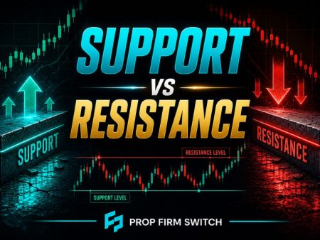
Because candlesticks visually display price behavior, they make it easier to identify trends, momentum shifts, support and resistance levels, and potential reversal areas.
Parts of a Candlestick
Every candlestick contains several components that show how the price moved during a specific period.
If the closing price is higher than the opening price, the candlestick is considered bullish and indicates buying pressure during that period. If the closing price is lower than the opening price, the candlestick is bearish and reflects stronger selling pressure.
The size of the body and wicks can also provide clues about market sentiment. Long bodies often indicate strong momentum, while long wicks may suggest rejection of higher or lower prices.
| Part | What It Represents |
| Open | The price at which the trading period began |
| High | The highest price reached during the period |
| Low | The lowest price reached during the period |
| Close | The final price at the end of the period |
| Body | The distance between the opening and closing prices |
| Upper Wick | Shows how far the price moved above the body before pulling back |
| Lower Wick | Shows how far the price moved below the body before recovering |
Common Candlestick Patterns for Beginners
Individual candlesticks and combinations of candles can provide insight into potential market direction. While no pattern guarantees a future price move, many traders use them alongside trend analysis, support and resistance, and volume.
Here are some of the most common candlestick patterns beginners should know:
Doji
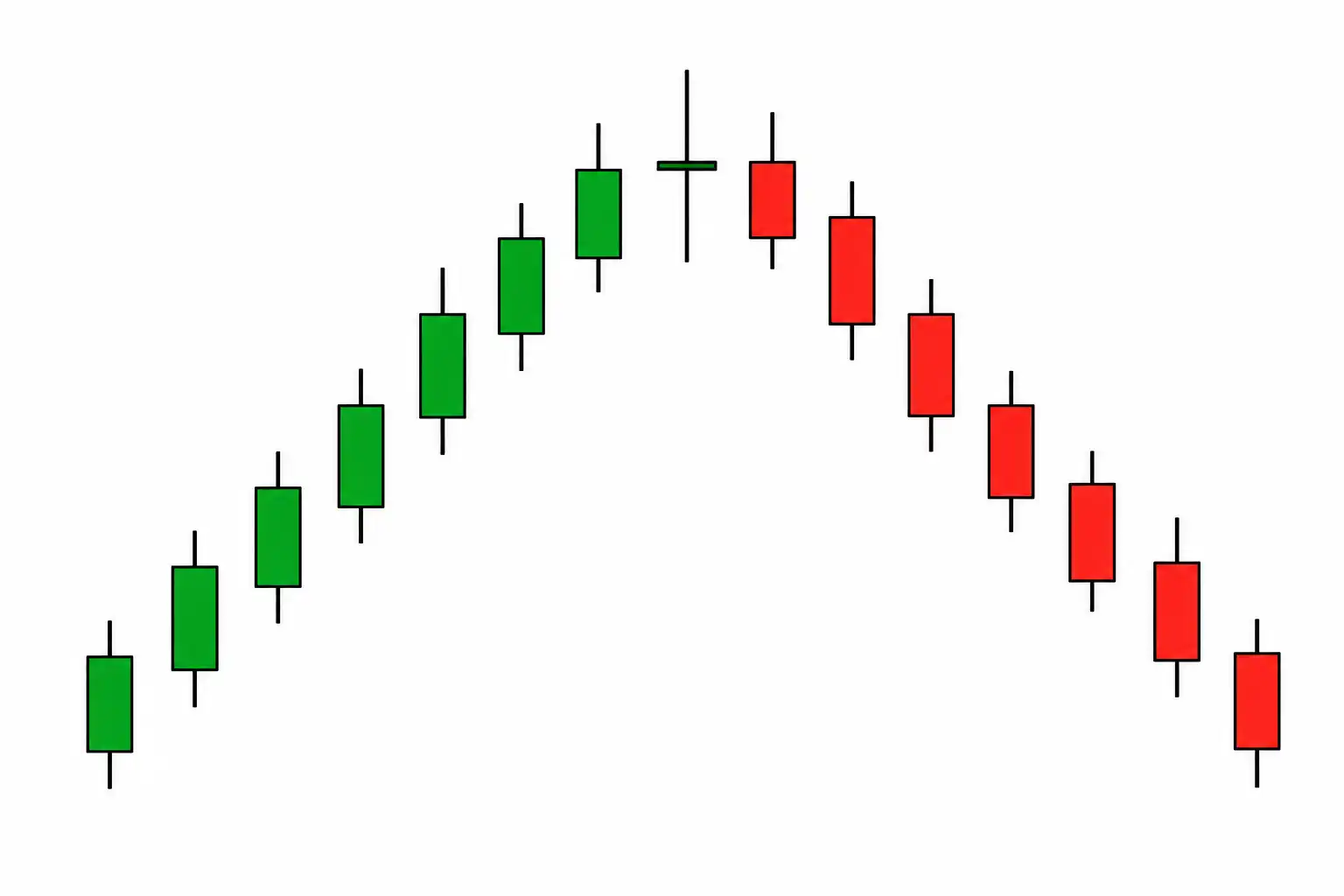
A Doji forms when the opening and closing prices are nearly the same, creating a very small body with upper and lower wicks. It reflects a temporary balance between buyers and sellers, where neither side gains clear control.
A Doji often appears after a strong uptrend or downtrend and may signal that momentum is weakening. However, by itself, it does not confirm a reversal. Traders usually wait for the next candle or additional technical confirmation before acting.
Because Dojis frequently appear during periods of consolidation, context is important. A Doji forming at a major support or resistance level generally carries more significance than one appearing in the middle of a sideways market.
Hammer
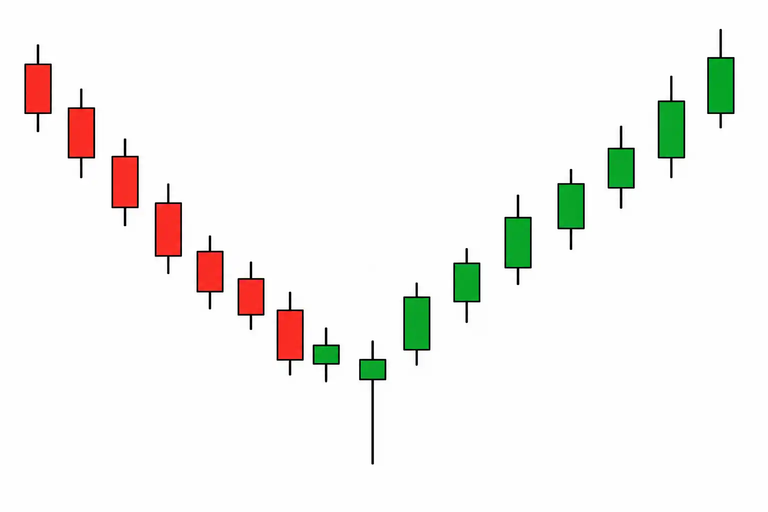
A Hammer has a small body near the top of the candle and a long lower wick that is typically at least twice the body’s length. The long wick shows that sellers pushed prices sharply lower during the session, but buyers stepped in and recovered most or all of the decline before the close.
This pattern usually forms after a downtrend and may signal that bearish momentum is fading. It reflects growing buying pressure as market participants reject lower prices. Many traders look for increased trading volume or a strong bullish candle immediately after the Hammer as confirmation that buyers are gaining control.
Shooting Star
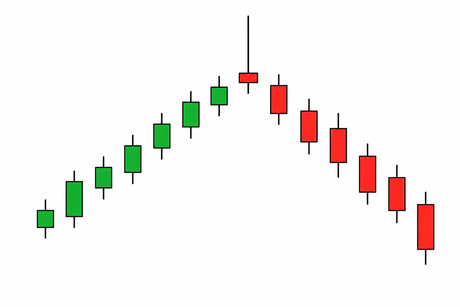
A Shooting Star has a small body near the bottom of the candle with a long upper wick, often at least two times the size of the body. It shows that buyers initially pushed prices higher but failed to maintain control as sellers forced the market back down before the close.
This pattern typically appears after an uptrend and may indicate weakening bullish momentum. It suggests that sellers are beginning to challenge the existing trend, although confirmation from the following candle is generally recommended.
A Shooting Star forming near a previous resistance level or after an extended rally is often considered more meaningful than one appearing during normal market fluctuations.

Bullish Engulfing
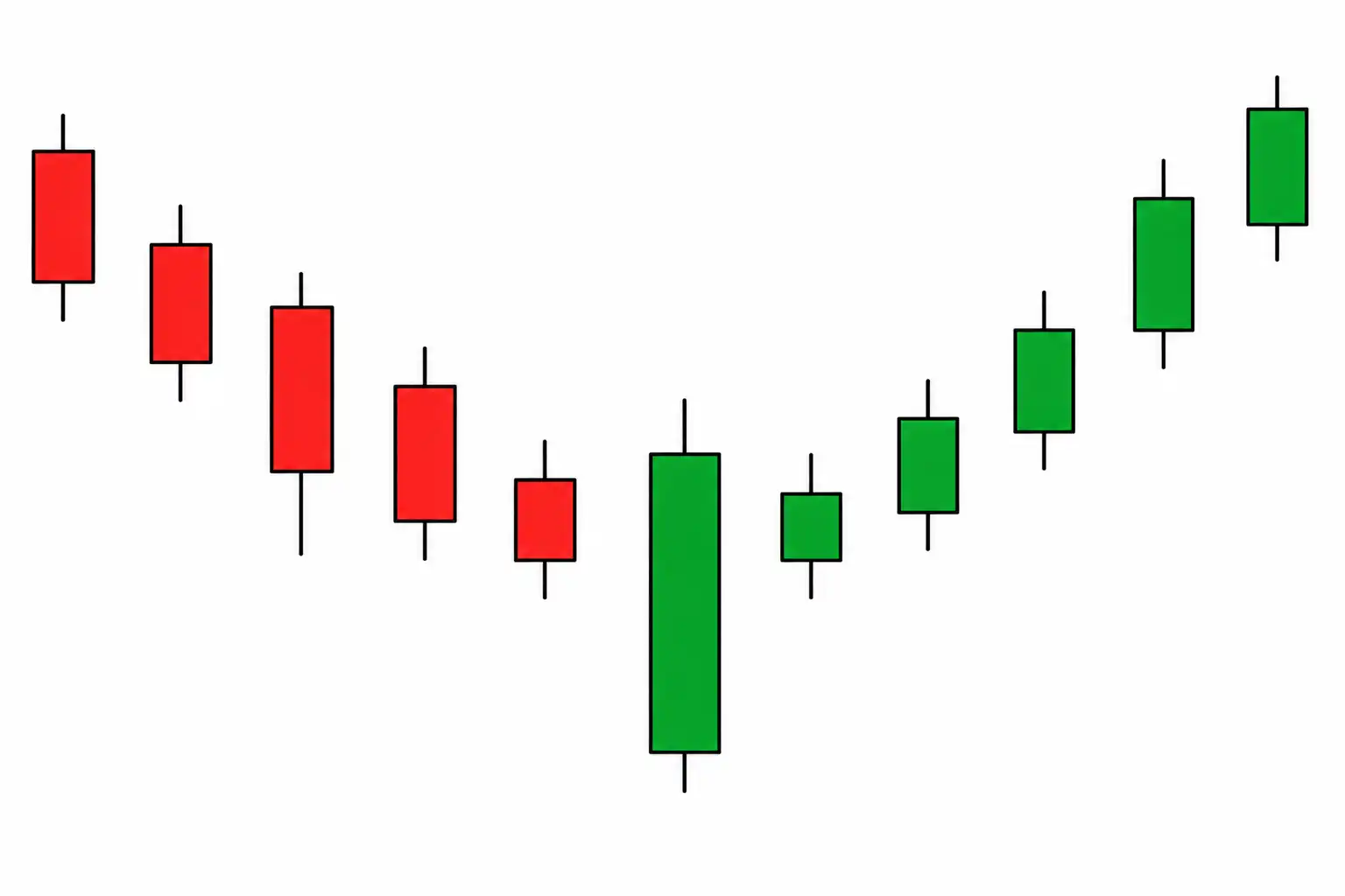
A Bullish Engulfing pattern consists of two candles. The first is bearish, while the second is a larger bullish candle whose body completely engulfs the previous candle’s body. The pattern signals a shift in momentum as buyers overwhelm the selling pressure from the previous session. It often appears after a decline and may indicate that demand is increasing.
Bullish Engulfing patterns are generally considered stronger when they occur near established support levels or after prolonged selling. Higher trading volume during the bullish candle can also strengthen the signal by indicating stronger buyer participation.
Bearish Engulfing
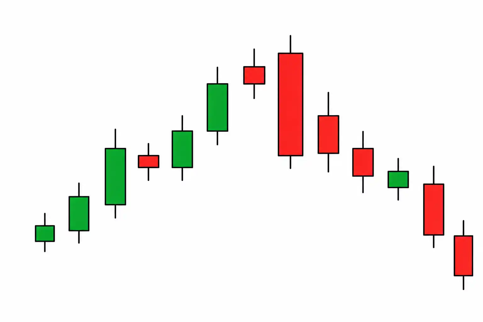
A Bearish Engulfing pattern is the opposite of a Bullish Engulfing pattern. It begins with a bullish candle followed by a larger bearish candle that completely engulfs the previous candle’s body.
This pattern suggests that sellers have regained control after buyers failed to maintain upward momentum. It commonly appears after an uptrend and may signal the beginning of a price correction or reversal.
Many traders look for confirmation through lower closes or increased selling volume before treating the pattern as a valid bearish signal.
Morning Star
The Morning Star is a three-candle bullish reversal pattern that often forms after a sustained decline. It begins with a large bearish candle, followed by a smaller candle showing indecision, and ends with a strong bullish candle that closes well into the range of the first candle.
The pattern reflects a gradual shift in market sentiment. Sellers dominate the first session, uncertainty develops during the second, and buyers regain control during the third.
Because it captures this transition in momentum, the Morning Star is widely followed by swing traders and technical analysts. The signal becomes more reliable when it forms near long-term support or after a significant decline.

Evening Star
The Evening Star is the bearish counterpart of the Morning Star and typically appears after an uptrend. It consists of a strong bullish candle, a smaller candle reflecting indecision, and a large bearish candle that closes deep into the first candle’s range.
The pattern suggests that buying momentum is slowing and that sellers are beginning to take control. It often appears near market highs where profit-taking and increased selling pressure emerge. Traders generally seek additional confirmation, such as a break below support or increased selling volume, before entering a bearish trade based on an Evening Star pattern.
How Traders Use Candlestick Charts
Candlestick charts are rarely used on their own. Instead, traders combine them with other forms of technical analysis to improve decision-making and identify higher-probability trade setups.
Identifying Market Trends
A series of higher highs and higher lows often signals an uptrend, while lower highs and lower lows may indicate a downtrend. Candlestick charts help traders recognize these patterns and follow the prevailing market direction.
Finding Potential Reversal Areas
Patterns such as Hammers, Shooting Stars, and Engulfing candles can signal that buying or selling momentum is weakening. When these patterns appear near key support or resistance levels, traders may watch for a possible reversal.
Confirming Breakouts
A breakout above resistance or below support is generally considered stronger when accompanied by large candlestick bodies and decisive closes. Strong candles can indicate conviction from market participants rather than a temporary price spike.
Measuring Market Momentum
The size of candlestick bodies provides clues about momentum. Large bullish candles often reflect aggressive buying, while large bearish candles may signal strong selling pressure. Consecutive candles in the same direction can indicate sustained momentum.
Combining With Other Indicators
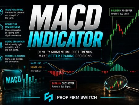
Many traders combine candlestick analysis with moving averages, RSI, MACD, volume, and trendlines to build a more complete view of the market. Using multiple forms of confirmation may help reduce false signals and improve trade selection.
Read the Story Behind the Candle
Candlestick charts do more than display price movements. They provide insight into the ongoing battle between buyers and sellers and help traders visualize changes in momentum and market sentiment.
Learning the basic structure of a candlestick and recognizing common patterns can improve chart-reading skills and provide valuable context when analyzing financial markets. At the same time, no candlestick pattern guarantees a specific outcome, which is why experienced traders combine candlestick analysis with trend analysis, risk management, and broader market context.
As with any trading skill, experience comes through practice. The more charts you study, the easier it becomes to recognize recurring patterns and understand the story price action is telling.